Creating a Beautiful Menu with Tailwind CSS: A Step-by-Step Guide
In this tutorial, we will learn how to create a beautiful menu using Tailwind CSS, a popular utility-first CSS framework. We will break down a code snippet and explain each part to understand how it contributes to the overall design and functionality of the menu. Don't worry if you're new to coding, as this tutorial is designed to be easily understood by beginners.

Setting up the Menu Structure
To start, let's examine the code snippet that sets up the basic structure of our menu:
<div class="bg-white shadow-lg rounded-xl max-w-xs mx-auto relative">
  <ul class="px-8 relative pb-5">
    <!-- Menu items go here -->
  </ul>
</div>
- The div element creates a container for our menu. We apply the classes bg-white, shadow-lg, rounded-xl, max-w-xs, mx-auto, and relative to style the container.
- Inside the container, we have the ul element, which represents an unordered list. We apply the classes px-8, relative, and pb-5 to style the list.
Adding Menu Items
Now let's explore how to add menu items to our menu:
<li class="flex items-center text-gray-900 text-md py-4">
  <span class="text-gray-400 mr-5">
    <svg class="w-7 h-7" fill="none" stroke="currentColor" viewBox="0 0 24 24" xmlns="http://www.w3.org/2000/svg">
      <path stroke-linecap="round" stroke-linejoin="round" stroke-width="2" d="M9 17V7m0 10a2 2 0 01-2 2H5a2 2 0 01-2-2V7a2 2 0 012-2h2a2 2 0 012 2m0 10a2 2 0 002 2h2a2 2 0 002-2M9 7a2 2 0 012-2h2a2 2 0 012 2m0 10V7m0 10a2 2 0 002 2h2a2 2 0 002-2V7a2 2 0 00-2-2h-2a2 2 0 00-2 2"></path>
    </svg>
  </span>
  Dashboard
</li>
- The li element represents a single menu item. We apply the classes flex, items-center, text-gray-900, text-md, and py-4 to style the item.
- Inside the menu item, we have the span element, which holds an icon. We apply the classes text-gray-400 and mr-5 to style the icon container.
- The svg element represents an SVG image. We apply the classes w-7 and h-7 to set the width and height of the icon.
- Within the svg element, the path element defines the shape and style of the icon using the stroke-linecap, stroke-linejoin, stroke-width, and d attributes.
- The text "Dashboard" represents the label for the menu item.
Styling the Menu
Now, let's enhance the visual appeal of our menu using Tailwind CSS classes:
<header class="bg-gradient-to-r from-cyan-500 to-cyan-600 transform flex items-center mb-10 py-8 px-6">
  <img class="rounded-full w-20 h-20 ring-4 ring-opacity-20 ring-gray-200" src="https://randomuser.me/api/portraits/women/79.jpg" alt="Dr. Jessica James">
  <div class="ml-5">
    <h1 class="text-white tracking-wide text-lg">Dr. Merlin White</h1>
    <p class="text-gray-300 tracking-wider text-sm">Blogger</p>
  </div>
</header>
- The header element represents the menu header. We apply the classes bg-gradient-to-r, from-cyan-500, to-cyan-600, transform, flex, items-center, mb-10, py-8, and px-6 to style the header.
- Inside the header, we have an img element that displays a profile picture. We apply the classes rounded-full, w-20, h-20, ring-4, ring-opacity-20, and ring-gray-200 to style the image.
- The div element contains the text content of the header. We apply the class ml-5 to add left margin for spacing.
- Inside the div, we have an h1 element that displays the name. We apply the classes text-white, tracking-wide, and text-lg to style the heading.
- The p element represents the occupation. We apply the classes text-gray-300, tracking-wider, and text-sm to style the paragraph.
Adding Interactivity
Lastly, let's incorporate an interactive button into our menu:
<button class="text-white capitalize text-sm bg-gradient-to-r from-cyan-500 to-cyan-600 inline-block rounded-md flex items-center py-2 pl-3 pr-4 shadow-md mx-auto tracking-wider mb-5">
  <svg class="w-6 h-6 mr-2" fill="none" stroke="currentColor" viewBox="0 0 24 24" xmlns="http://www.w3.org/2000/svg">
    <path stroke-linecap="round" stroke-linejoin="round" stroke-width="2" d="M12 6v6m0 0v6m0-6h6m-6 0H6"></path>
  </svg>
  Add Section
</button>
- The button element represents an interactive button. We apply various classes to style the button, including text-white, capitalize, text-sm, bg-gradient-to-r, from-cyan-500, to-cyan-600, inline-block, rounded-md, flex, items-center, py-2, pl-3, pr-4, shadow-md, mx-auto, tracking-wider, and mb-5.
- Inside the button, we have an svg element that displays an icon. We apply the classes w-6, h-6, and mr-2 to style the icon container.
- The path element within the svg element defines the shape and style of the icon using the stroke-linecap, stroke-linejoin, stroke-width, and d attributes.
- The text "Add Section" represents the label for the button.
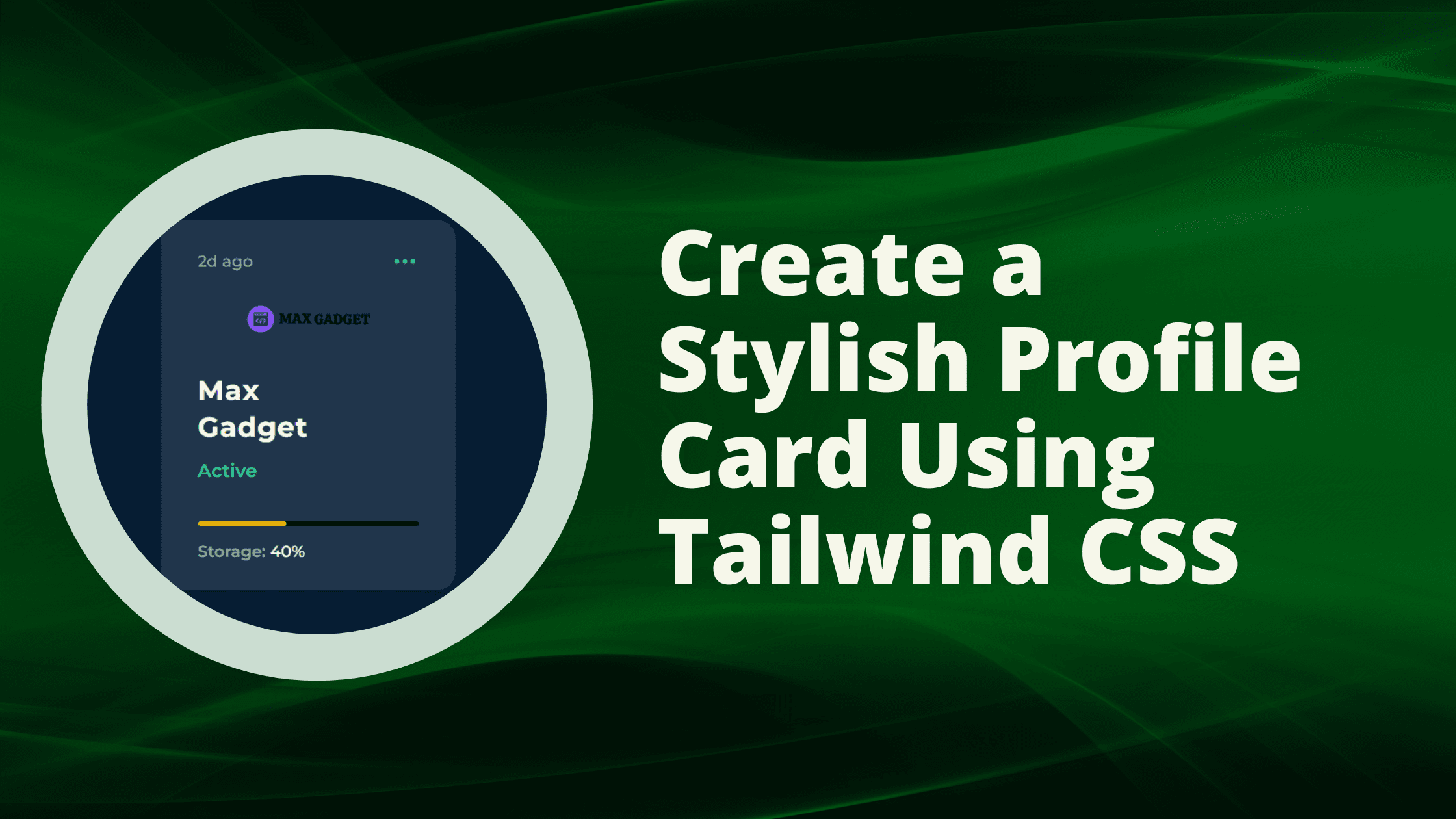
Also Read : How To Create a Stylish Profile Card Using Tailwind CSS
Conclusion:
In this tutorial, we have learned how to create a beautiful menu using Tailwind CSS. By leveraging the power of Tailwind CSS classes, you can easily customize and create visually appealing menus for your web projects.
Remember, practice makes perfect, so don't hesitate to experiment and tweak the code to suit your own design preferences. Happy coding!