How To Create a Stylish Profile Card Using Tailwind CSS
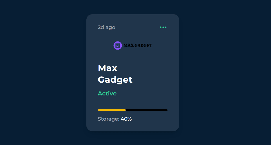
In this tutorial, we will learn how to create a stylish profile card using Tailwind CSS. A profile card is a common component used in many websites to display information about a person or a company. We will go through each section of the provided code snippet and explain its purpose. Here is is how looks:
Is not that cool? Lets dive in and learn how we can create the profile card with tailwindcss.
Setting Up Fonts and Styling
To begin, we need to include the necessary CSS and font files. Add the following code snippet to the head section of your HTML document:
<link rel="preconnect" href="https://fonts.googleapis.com">
<link rel="preconnect" href="https://fonts.gstatic.com" crossorigin>
<link href="https://fonts.googleapis.com/css2?family=Montserrat:wght@400;500;600;700&display=swap" rel="stylesheet">
The above code imports the Montserrat font from Google Fonts, which we will use to style our profile card.
Creating the Profile Card Container
Next, we will create the main container for our profile card. Use the following code:
<section style="font-family: Montserrat" class="bg-[#071e34] flex font-medium items-center justify-center h-screen">
- The <section> tag represents a section of the webpage, and we give it a class of bg-[#071e34] to set the background color to a dark blue shade.
- The flex class is used to create a flex container, allowing us to easily align and position the card's content.
- The font-medium class sets the font weight to medium for the text inside the container.
- The items-center and justify-center classes center the content vertically and horizontally.
- The h-screen class makes the container take up the entire height of the screen.
Adding the Card Content - Time and Icon
Inside the main container, we will add the content for our profile card. Use the following code:
<section class="w-64 mx-auto bg-[#20354b] rounded-2xl px-8 py-6 shadow-lg">
    <div class="flex items-center justify-between">
        <span class="text-gray-400 text-sm">2d ago</span>
        <span class="text-emerald-400">
            <svg xmlns="http://www.w3.org/2000/svg" class="h-6 w-6" fill="none" viewBox="0 0 24 24" stroke="currentColor">
            <path stroke-linecap="round" stroke-linejoin="round" stroke-width="2" d="M5 12h.01M12 12h.01M19 12h.01M6 12a1 1 0 11-2 0 1 1 0 012 0zm7 0a1 1 0 11-2 0 1 1 0 012 0zm7 0a1 1 0 11-2 0 1 1 0 012 0z" />
          </svg>
        </span>
    </div>
    <!-- Rest of the code goes here -->
</section>
- The outer <section> element represents the profile card container. It has a fixed width of 64 units (w-64) and is horizontally centered (mx-auto).
- The bg-[#20354b] class sets the background color of the card to a slightly lighter shade of blue.
- The rounded-2xl class gives the card rounded corners.
- The px-8 and py-6 classes add padding to the left/right and top/bottom of the card, respectively.
- The shadow-lg class applies a shadow effect to the card.
Inside the card container, we have a <div> element with classes flex, items-center, and justify-between. This <div> is used to create a flex container for the content within it.
Within the flex container, we have two <span> elements. The first <span> with classes text-gray-400 and text-sm displays the text "2d ago" in a light gray color and smaller font size. This could represent the time since a certain event occurred. The second <span> contains an SVG icon of a checkmark. It uses the text-emerald-400 class to set the color to an emerald green shade.
Adding the Profile Picture
Next, we will add the profile picture to the card. Use the following code:
<div class="mt-6 w-fit mx-auto">
    <img src="https://maxgadget.site/assets/images/resources/logo.png" class="rounded-full w-28" alt="profile picture" srcset="">
</div>
- The outer <div> element is used to create some top margin (mt-6) and horizontally center the profile picture (mx-auto).
- Inside the <div>, we have an <img> element that displays the profile picture. The src attribute contains the URL of the image you want to use.
- The rounded-full class gives the image a circular shape, and the w-28 class sets the width to 28 units.
Adding the Name and Status
Now, let's add the name and status information to the profile card. Use the following code:
<div class="mt-8">
    <h2 class="text-white font-bold text-2xl tracking-wide">Max <br/> Gadget</h2>
</div>
<p class="text-emerald-400 font-semibold mt-2.5">
    Active
</p>
- The outer <div> element has a top margin of mt-8.
- Inside the <div>, we have an <h2> element that displays the name "Max Gadget". The classes text-white, font-bold, text-2xl, and tracking-wide are used to set the text color to white, make it bold, set the font size to 2xl, and add some letter spacing.
- The <br/> tag is used to create a line break between the first and last name.
- After the <h2> element, we have a <p> element that displays the status "Active". The classes text-emerald-400, font-semibold, and mt-2.5 are used to set the text color to an emerald green shade, make it semi-bold, and add some top margin.
Adding the Storage Progress Bar
To visualize the storage progress, we will add a progress bar. Use the following code:
<div class="h-1 w-full bg-black mt-8 rounded-full">
    <div class="h-1 rounded-full w-2/5 bg-yellow-500"></div>
</div>
- The outer <div> element represents the progress bar container. It has a height of 1 unit (h-1), fills the entire width of the card (w-full), and has a black background (bg-black).
- The mt-8 class adds top margin to create some space between the progress bar and the previous content.
- Inside the progress bar container, we have another <div> element. This inner <div> represents the progress itself. It has a height of 1 unit, a width of 2/5th of the container's width (w-2/5), and a yellow background (bg-yellow-500). Adjust the w-2/5 value as needed to reflect the actual progress.
Adding Storage Percentage
Finally, let's add the storage percentage to the profile card. Use the following code:
<div class="mt-3 text-white text-sm">
    <span class="text-gray-400 font-semibold">Storage:</span>
    <span>40%</span>
</div>
- The outer <div> element has a top margin of mt-3.
- Inside the <div>, we have two <span> elements. The first <span> displays the text "Storage:" in a light gray color and semi-bold font weight. The second <span> displays the storage percentage, which is set to "40%" in this example. Adjust the value as needed.
Conclusion:
Congratulations! You have successfully created a stylish profile card using Tailwind CSS. By understanding the different sections of the code snippet and their purpose, you can customize and build upon this profile card to fit your own project's needs. Tailwind CSS provides a wide range of utility classes that make it easy to style and structure your components. You can experiment with different colors, fonts, and layouts to create your own unique profile cards. Happy coding!