How to Create fully Responsive React Tailwind Sidebar with Dropdowns
I have been using Tailwind CSS in most of my recent projects and I love how easy it is. However, if we compare it to bootstrap or other frameworks, it lacks base components that can help build sites faster. So, I tried to build components from scratch. Here is how I achieved creating a responsive sidebar with the dropdown in React and tailwind CSS.
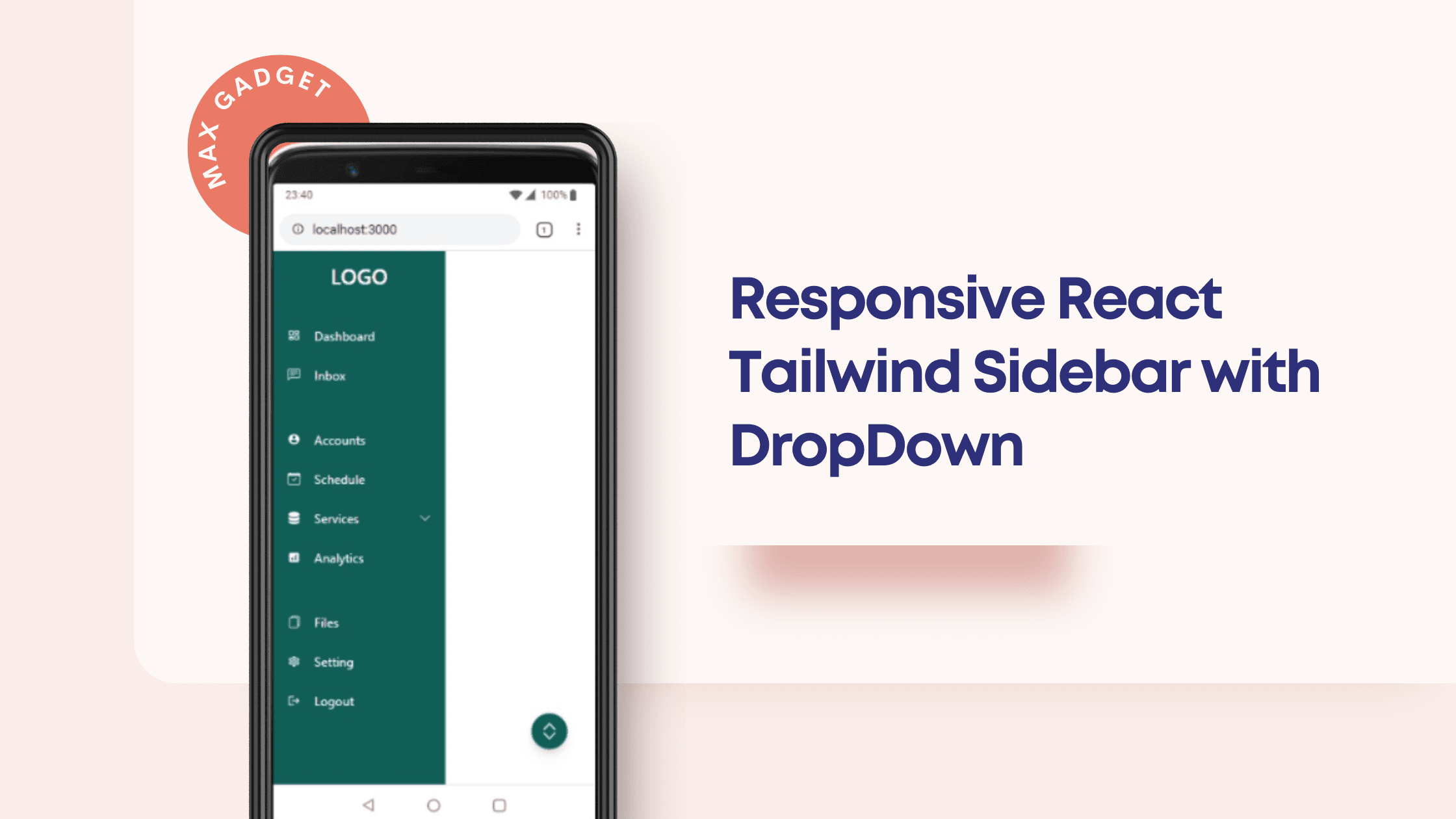
Here is how the component will look on different platforms like PC, tablets, and mobile phones.
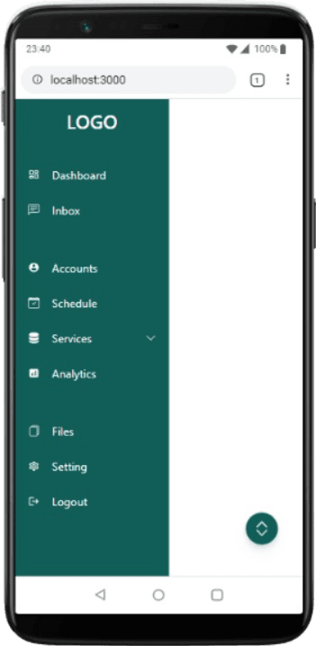
So, as you can see, I have created a floating button that is used to Show and Hide the sidebar component on smaller screens.
<button
        className="fixed lg:hidden z-90 bottom-10 right-8 bg-teal-800 w-10 h-10 rounded-full drop-shadow-lg flex justify-center items-center text-white text-4xl hover:bg-teal-800   duration-300"
        onClick={toggleSidebar}
      >
        <span class="text-white">
          <svg
            xmlns="http://www.w3.org/2000/svg"
            fill="currentColor"
            class="w-6 m-auto"
            viewBox="0 0 16 16"
          >
            <path
              fill-rule="evenodd"
              d="M3.646 9.146a.5.5 0 0 1 .708 0L8 12.793l3.646-3.647a.5.5 0 0 1 .708.708l-4 4a.5.5 0 0 1-.708 0l-4-4a.5.5 0 0 1 0-.708zm0-2.292a.5.5 0 0 0 .708 0L8 3.207l3.646 3.647a.5.5 0 0 0 .708-.708l-4-4a.5.5 0 0 0-.708 0l-4 4a.5.5 0 0 0 0 .708z"
            />
          </svg>
        </span>
      </button>
Now that we have created the floating button, we can move next to create the sidebar component. The sidebar component is going to have a dropdown menu, so I have created a menu links route with the appropriate icons. By mapping the menus array we can add the menu to the sidebar.
const Menus = [
  { title: 'Dashboard', src: 'Chart_fill', icon: <MdOutlineDashboard /> },
  { title: 'Inbox', src: 'Chat', icon: <BsChatLeftText /> },
  { title: 'Accounts', src: 'User', gap: true, icon: <MdAccountCircle /> },
  { title: 'Schedule ', src: 'Calendar', icon: <BsCalendarCheck /> },
  {
    title: 'Services',
    src: 'Services',
    icon: <BsServer />,
    subMenus: [
      {
        title: 'Service 1',
        src: '/services/services1',

        cName: 'sub-nav',
      },
      {
        title: 'Service 2',
        src: '/services/services2',

        cName: 'sub-nav',
      },
      {
        title: 'Service 3',
        src: '/services/services3',
      },
    ],
  },
  { title: 'Analytics', src: 'Chart', icon: <MdAnalytics /> },
  { title: 'Files ', src: 'Folder', gap: true, icon: <BsFiles /> },
  { title: 'Setting', src: 'Setting', icon: <MdOutlineSettings /> },
  { title: 'Logout', src: 'Logout', icon: <MdLogout /> },
];
Here is how the sidebar.jsx file looks like :
import React, { useState } from 'react';
import {
  MdOutlineDashboard,
  MdAccountCircle,
  MdAnalytics,
  MdOutlineSettings,
  MdLogout,
} from 'react-icons/md';
import {
  BsChevronDown,
  BsChatLeftText,
  BsCalendarCheck,
  BsFiles,
  BsServer,
} from 'react-icons/bs';

const Menus = [
  { title: 'Dashboard', src: 'Chart_fill', icon: <MdOutlineDashboard /> },
  { title: 'Inbox', src: 'Chat', icon: <BsChatLeftText /> },
  { title: 'Accounts', src: 'User', gap: true, icon: <MdAccountCircle /> },
  { title: 'Schedule ', src: 'Calendar', icon: <BsCalendarCheck /> },
  {
    title: 'Services',
    src: 'Services',
    icon: <BsServer />,
    subMenus: [
      {
        title: 'Service 1',
        src: '/services/services1',

        cName: 'sub-nav',
      },
      {
        title: 'Service 2',
        src: '/services/services2',

        cName: 'sub-nav',
      },
      {
        title: 'Service 3',
        src: '/services/services3',
      },
    ],
  },
  { title: 'Analytics', src: 'Chart', icon: <MdAnalytics /> },
  { title: 'Files ', src: 'Folder', gap: true, icon: <BsFiles /> },
  { title: 'Setting', src: 'Setting', icon: <MdOutlineSettings /> },
  { title: 'Logout', src: 'Logout', icon: <MdLogout /> },
];

const Sidebar = () => {
  const [open, setOpen] = useState(true);
  const [subMenuOpen, setSubMenuOpen] = useState(false);
  const toggleSidebar = () => {
    setOpen(!open);
  };
  return (
    <div className=" h-screen flex items-end justify-end ">
      <button
        className="fixed lg:hidden z-90 bottom-10 right-8 bg-teal-800 w-10 h-10 rounded-full drop-shadow-lg flex justify-center items-center text-white text-4xl hover:bg-teal-800   duration-300"
        onClick={toggleSidebar}
      >
        <span class="text-white">
          <svg
            xmlns="http://www.w3.org/2000/svg"
            fill="currentColor"
            class="w-6 m-auto"
            viewBox="0 0 16 16"
          >
            <path
              fill-rule="evenodd"
              d="M3.646 9.146a.5.5 0 0 1 .708 0L8 12.793l3.646-3.647a.5.5 0 0 1 .708.708l-4 4a.5.5 0 0 1-.708 0l-4-4a.5.5 0 0 1 0-.708zm0-2.292a.5.5 0 0 0 .708 0L8 3.207l3.646 3.647a.5.5 0 0 0 .708-.708l-4-4a.5.5 0 0 0-.708 0l-4 4a.5.5 0 0 0 0 .708z"
            />
          </svg>
        </span>
      </button>

      <div
        className={` ${
          open ? 'w-48 px-2 ' : 'w-0 '
        } lg:w-72 bg-teal-800 h-screen   relative duration-500`}
      >
        <div className=" justify-center mt-3">
          <h1
            className={`text-white  font-medium text-2xl text-center duration-200 ${
              !open && 'invisible'
            }`}
          >
            LOGO
          </h1>
        </div>
        <ul className="pt-6">
          {Menus.map((Menu, index) => (
            <>
              <li
                key={index}
                className={`flex  rounded-md p-2 cursor-pointer hover:bg-teal-400 text-white text-sm items-center gap-x-4
              ${Menu.gap ? 'mt-9' : 'mt-2'}  `}
              >
                {Menu.icon ? Menu.icon : <MdOutlineDashboard />}
                <span className="flex-1">{Menu.title}</span>
                {Menu.subMenus && (
                  <BsChevronDown
                    onClick={() => setSubMenuOpen(!subMenuOpen)}
                    className={`${subMenuOpen && 'rotate-180'}`}
                  />
                )}
              </li>
              {Menu.subMenus && subMenuOpen && open && (
                <ul>
                  {Menu.subMenus.map((subMenuItem, idx) => (
                    <li
                      key={idx}
                      className="flex px-5 cursor-pointer text-center text-sm text-gray-200 py-1"
                    >
                      {subMenuItem.title}
                    </li>
                  ))}
                </ul>
              )}
            </>
          ))}
        </ul>
      </div>
    </div>
  );
};

export default Sidebar;
You can get the full source code from the Github Link.